ShopDreamUp AI ArtDreamUp

Deviation Actions


Suggested Deviants


Suggested Collections


You Might Like…


Featured in Groups


Description
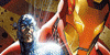
Check it out! Which version do you like better?
Spiderman copyrighted to Marvel Entertainment.
Spiderman copyrighted to Marvel Entertainment.
Image size
1000x813px 235.7 KB
© 2012 - 2024 jakeandersonstudio
Comments19
Join the community to add your comment. Already a deviant? Log In
The overall design is pretty good and the light choice is nice, but you're being beaten in the details. I'm not sure how you went about constructing the city, but the nice straight line are overshadowed by the points where it looks like you freehanded them. If the were all wavy it wouldn't be such an issue. But since the majority are clean and strait, the few wavy, irregular sections really draw attention.
For Spiderman's pose, you have good elements, but the don't necessarily fit well together. For example, the bent leg and the chest/upper abdomen look good to me but the waist/hip are seem a bit disjointed to me. The hip in particular ruins the graceful curves of the pose.
Again, overall a decent design. Just bit more attention to the details.